HTML and CSS Tutorial
HTML Element
| Tag | Description |
|---|---|
<!--...--> |
Defines a comment; support line breaks; Quarto also use HTML comments; |
<!DOCTYPE> |
Defines the document type |
<a> |
Defines a hyperlink |
<link> |
defines the relationship between the current document and an external resource. Most often used to link to external style sheets ( .css). |
<h1> to <h6> |
headings; Bootstrap framework commonly adds .h4 as a utility class to make non-heading elements look like h4 headings, e.g., <p class="h4">. |
<img> |
image |
<figure> |
mark up a figure in a document |
<figcaption> |
define a caption for the figure |
<div> |
Defines a division. The <div> tag is used as a container for HTML elements - which is then styled with CSS or manipulated with JavaScript.The <div> tag is easily styled by using the class or id attribute. |
<span> |
An inline container used to mark up a part of a text, or a part of a document. The <span> tag is easily styled by CSS or manipulated with JavaScript using the class or id attribute.The <span> tag is much like the <div> element, but <div> is a block-level element and <span> is an inline element. |
<hr> |
a horizontal rule that is used to separate content |
<br> |
Forced line break |
<script> |
To embed a client-side script (JavaScript). Either contains scripting statements, or it points to an external script file through the src attribute. |
<strong> |
Show importance. Most browsers use boldface for enclosed text, but might be different. |
<b> |
Alternative way to make text bold |
<span style="font-weight: bold;"> |
Inline css to make text bold. |
<em> |
use italic font, show emphasis |
<u> |
underline text |
<tt> |
monostyle/typewriter, commonly used for code |
<mark> |
highlight text |
<del> / <s> |
style="text-decoration: line-through;" |
<ins> |
insert text, show underline |
<sub> |
for subscript |
<sup> |
for superscript |
<pre> |
Defines preformatted text; commonly used for monospaced source code; preserves whitespace like space, tabs, and newlines. |
<p> |
Paragraph; collapse consecutive spaces and line breaks into one. |
<code> |
Inline code element. Equivalent to backticks, `code`. Use font-family: monospace. |
References:
- https://developer.mozilla.org/en-US/docs/Web/CSS/border
- https://html.com/tables/rowspan-colspan/
- https://www.w3.org/TR/CSS2/text.html#alignment-prop
An HTML prototype example
<!DOCTYPE html>
<html>
<head>
  <title>A Meaningful Page Title</title>
  <script>
  function myFunction() {
    document.getElementById("demo").innerHTML = "Paragraph changed.";
  }
  </script>
  <style>
    h1 {color:red;}
    p {color:blue;}
	</style>
  <link rel="stylesheet" href="mystyle.css">
  <meta charset="UTF-8">
</head>

<body>

The content of the document......

<h2>Demo JavaScript in Head</h2>

<p id="demo">A Paragraph</p>
<button type="button" onclick="myFunction()">Try it</button>

</body>
</html>
The <head> element is a container for metadata (data about data) and is placed between the <html> tag and the <body>tag.
HTML metadata is data about the HTML document. Metadata is not displayed on the page.
The HTML <head> element is a container for the following elements:
-
<title>: define document title -
<style>: Internal stylesheet. Define a simple style information (CSS) for a document.If some properties have been defined for the same selector (element) in different style sheets, the value from the last read style sheet will be used (see example below)!
  <head>
<style>
  h1 {color:red;}
  p {color:blue;}
</style>
<style>
  h1 {color:green;}
  p {color:pink;}
</style>
</head>
You can have multiple styles for the same elements. In this case, the one that was latest defined will be applied.
-
<link>: most often used to link to an external style sheet<head> <link rel="stylesheet" href="styles.css"> </head>- The
<link>element is an empty element (meaning it won’t show), it contains attributes only. -
A
<link>element can occur either in the<head>or<body>element, depending on whether it has a link type that is body-ok.relattribute specifies the link type.For example, the
stylesheetlink type is body-ok, and therefore<link rel="stylesheet">is permitted in the body. However, this isn’t a good practice to follow; it makes more sense to separate your<link>elements from your body content, putting them in the<head>.-
When using
<link>to establish a favicon for a site, and your site uses a Content Security Policy (CSP) to enhance its security, the policy applies to the favicon. If you encounter problems with the favicon not loading, verify that theContent-Security-Policyheader’simg-srcdirective is not preventing access to it. -
rel="icon"is used to specify a favicon for a website. The favicon will show in tabs, bookmarks, address bar.rel="shortcut icon"is used in older browsers.rel="apple-touch-icon"is used to specify an icon for IOS devices (iPhone/iPad). When you add your site to home screen, this will be used.
-
- The
-
<script>: define client-side Java scripts <base>: specifies the base URL and/or target for all relative URLs in a document.<meta>: specify character set, page description, keywords, author of the document, and viewport settings
<script>
The HTML <script> tag is used to define a client-side script (JavaScript).
The <script> element either contains script statements, or it points to an external script file through the src attribute.
Click the button and change the paragraph content below.
A Paragraph
-
You can place any number of scripts in an HTML document.
-
Scripts can be placed in the
<body>, or in the<head>section of an HTML page, or in both. -
External JavaScript can be specified with
<script src="myScript.js"></script>
Force line break
In html, <br/> (or <br /> with a space before /, or simply <br>) and \ (single backslash) give a single line break.
- If it doesn’t work, add a black line above and below.
</br>is nonsense. Don’t use that.
Add a blank line
use (followed by a blank line) or <p> </p>.
Note that stands for non-breaking space.
If you feel the space is too large or too small, you can adjust vertical space
-
specify margin with positive or negative values to increase or decrease vertical space
<p style="margin-top:-1cm;"> </p>
Add horizontal space
Any leading spaces in HTML are ignored. To add horizontal space, you have several options:
-
use
 (em space) or (en space) for horizontal space. is about the width of a capital “M” in the current font and size. is about half the width of an “M” in the current font and size.
-
(non-breaking space) is about the width of a lowercase “n” in the current font and size.Size:
 > > -
<span style="padding-left:2ch>adds horizontal space of 2 characters.
Any size of vertical space
<div style="height:3px;"><br></div>
Add External css Stylesheet
<link rel="stylesheet" href="mystyle.css">
relstands for “relationship”. It is one of the key features of the<link>element — the value denotes how the item being linked to is related to the containing document.hrefpath to the stylesheet.
Add an image
-
no caption
<!-- only need the "img" tag --> <img src="https://drive.google.com/thumbnail?id=1nxfdIKXgZvOqXVSeA3h_hf0yxmsM361l&sz=w1000" alt="Phi_b" style="display: block; margin-right: auto; margin-left: auto; zoom:80%;" />-
zoom: 80%;here refers to the original size of the image, scale to 80% while keeping the aspect ratio. -
width: 80vw;refers to the viewport width, scale to 80% of the window width while keeping the aspect ratio. ✅One benefit of using
vwis that if you set all images towidth: 80vw;, the images will be of the same width, making your website look more consistent.The drawback is that when your window is small, the images will be rescaled proportionally, which might make them too small to see clearly.
-
You can set an exact size using
height="30" width="30". This will set the image with a height of 30 pixels and a width of 30 pixels.Tip: Always specify both the
heightandwidthattributes for images. If height and width are set, the space required for the image is reserved when the page is loaded. -
srccan be any URL.
-
-
side-by-side image in one row
<div style="display: flex; gap: 10px; justify-content: center;">
<img src="https://drive.google.com/thumbnail?id=&sz=w1000" alt="" style="width: 48%; object-fit: contain;" />
<img src="https://drive.google.com/thumbnail?id=&sz=w1000" alt="" style="width: 48%; object-fit: contain;" />
</div>
<div style="display: flex">creates a flex container, which allows you to arrange its child elements (the images) in a row or column. By default, it arranges them in a row.object-fit: containproperty specifies how the contents should be resized to fit its container. Keeps its aspect ratio. Fits inside its box. Doesn’t get cropped or stretched. -
with caption
<!-- need to surround the "img" tag with "figure" and "figcaption" -->
<figure style="text-align: center;">
<img src="https://drive.google.com/thumbnail?id=1nxfdIKXgZvOqXVSeA3h_hf0yxmsM361l&sz=w1000" alt="Phi_b" style="display: block; margin-right: auto; margin-left: auto; zoom:80%;" />
<figcaption>The $\Phi$ and $\phi$ functions (CDF and pdf of standard normal).</figcaption>
</figure>
If want to center align the image, use the following style:
<figure style="display: flex; flex-direction: column; align-items: center; text-align: center;"> -
inline image
<img src="https://drive.google.com/thumbnail?id=1Ec_oVF6wwb-nnGt-EDkqLrzg88DR3qZm&sz=w1000" alt="巡航" style="zoom:40%;" />Can use absolute size as well:
<img src="..." heigt="30" width="30" alt="巡航" />This sets the image height and width to be 30 pixels, ideal for inline icon images.
Embed images using relative path
Images can be stored in a folder named images or assets within your project directory. Then you can use relative path to embed the image as follows.
<img src="{{site.baseurl}}/images/image-20230730113759915.png" alt="quadrant geometry" style="display: block; margin-right: auto; margin-left: auto; zoom:50%;" />
Image on GitHub
An image hosted on GitHub has the following URL format:
https://github.com/overleaf-workshop/Overleaf-Workshop/blob/master/docs/assets/screenshot-online-collaborators.png
To embed the image in your HTML, you need to use the raw version of the image URL.
You need to replace blob with raw.
The raw URL format is:
https://github.com/overleaf-workshop/Overleaf-Workshop/raw/master/docs/assets/screenshot-online-collaborators.png
Then you can use the raw URL in the src attribute of the <img> tag.
Center Images
If you don’t want to specify inline style for each image, you can use a CSS class to center images.
-
Add HTML:
<img src="paris.jpg" alt="Paris" class="center"> -
Set left and right margin to
autoand make it into ablockelement:.center { display: block; margin-left: auto; margin-right: auto; width: 50%; }
Q: How to resize img?
A: Using the height and width attributes on the img tag. These values specify the height and width of the image element in pixels.
When you specify both
heightandwidth, the image is forced to fit the requested dimension. It could change the original aspect ratio.
Q: How to preserve the aspect ratio while resizing images?
A: Specify only width and set height to auto. Or the other way around, specify height and set width as auto.
img {
  width: 400px,
  height: auto
}
Q: How to add rounded corners to an image?
A: Use the style="border-radius:30px;" property in CSS.
img {
  border-radius: 30px;
}
The value accepts percentage as well, e.g., border-radius: 50% will make the image into a circle.
Embed a pdf file
<object class="pdf"
        data="/Econ-Study/images/EU-Kontroll.pdf"
        width="800"
        height="500">
</object>
It will generate a viewer widow with the specified width and height. You can scroll to view the whole pdf file.
Attributes
The id attribute is used to give a unique name or identifier to an element within a document. This makes it easier to select the element using CSS or JavaScript.
Like id attribute, the class attribute is also used to identify elements.
- But unlike
id, theclassattribute does not have to be unique in the document. - This means you can apply the same
classto multiple elements in a document.
You can apply one or more CSS classes to various document entities including headings, images, divs, and spans.
Specify typesetting for tags. Universally applicable as long as the tag supports the attribute.
Global attributes are attributes that can be used with all HTML elements.
Attributes define additional characteristics or properties of the element such as width and height of an image. Attributes are always specified in the start tag (or opening tag) and usually consist of name/value pairs like name="value". Attribute values should always be enclosed in quotation marks "<value>".
- Attributes must be separated from each other by one or more space characters.
Style
style attribute specifies an inline style for an element, such as color, font, size. It allows you to specify multiple attributes at one time. It is equivalent to use font-size="12px".
It overrides any style set globally, e.g. styles specified in the <style> tag or in an external style sheet.
冒号赋值,分号分隔 properties。
Now we run into the usage of the word property. Each property consists of a property-key and it’s associated VALUE, separated by a colon :.
The basic syntax is style="property: value; property: value;.
If you have more then one property you use the semi-colon ; as separator.
Notes about style attribute:
- HTML allows spaces around equal signs, but it is recommended to use
style="property: value;"without spaces around the equal sign. - Use semicolon after each property-value pair, including the last one.
- Use a space after a property name’s colon
:. - Only use quotes (
'') around values if the value contains spaces or special characters.- Use single (
'') rather than double ("") quotation marks for attribute selectors and property values.
- Use single (
Further reading: Google HTML/CSS Style Guide
Here are some commonly used properties:
-
font-size: 12px;字号 sets font size to be 12px. It is recommend to use a relative size (e.g., 1em) than absolute size because it allows the font to scale with user browsers. -
font-weight: normal | bold;加粗 specifies the weight of a font: boldface or normal -
font-style: normal | italic | oblique;斜体 specify italic text. -
height: 500; width: 500;set the width and height in pixels.- it’s useful to set
heigh: auto;so that the aspect ratio of the image is maintained.
- it’s useful to set
-
style = “font-size: 12px; background-color: blue;”to specify multiple properties.It is equivalent to
font-size="12px" background-color="blue".Note that if specify properties one-by-one: 等号赋值,值要放在引号内;空格分隔 properties。
- key and value are connected using equal sign
key="value"; - value is quoted using double quotes
"value"; - multiple properties are separated by spaces.
- key and value are connected using equal sign
-
text-align: left | right | center | justify;specify the horizontal alignment of text.justifyeach line is stretched so that every line has equal width, and the left and right margins are straight.
-
vertical-align: top | middle | bottom;specify the vertical alignment of text.Other possible values:
baseline: aligns the baseline of the element with the baseline of its parent.sub,super: aligns the element as subscript or superscript.text-top,text-bottom: aligns the top or bottom of the element with the top or bottom of the parent element’s font. → Sometimestop/bottomdoes not work as expected, so you can usetext-top/text-bottominstead.
margin: 25pxall four margins are 25px;margin: 25px 50px;top-bottom 25px; left-right 50px;margin: 25px 50px 75px;top 25px, left-right 50px, bottom 75px;-
margin: 25px 50px 75px 100px;top=25px, right=50px, bottom=75px, left=100px, clockwise, start from top; -
margin-bottom: 20pxcontrols the space outside of an element. Specify one side. Also havemargin-top,margin-left, andmargin-right. -
padding-bottom: 20pxcontrols the space inside of an element. Same way to specify asmargin. Can specify one side, or can use a sequence to specify all sides. border: solid red 2px;red box four sides.
padding 在框里面
margin 在框外面
border 定义框本身
/* one simplest box */
.boxed {
    border: 1px solid #535353;
    padding-bottom: 20px;
}
Center and bold
<div class = "boxed">
<p style="text-align:center; font-weight:bold;">Linear CEF Model</p>

$$
\begin{aligned}
y &=  \boldsymbol{x}'\boldsymbol{\beta} + u \\
\mathbb{E}(u|\boldsymbol{x}) &= 0
\end{aligned}
$$
</div>
Properties
font-weight sets how thick or thin characters in text should be displayed.
p.normal {
  font-weight: normal;
  font-style: italic;
}

p.thick {
  font-weight: bold;
}

p.thicker {
  font-weight: 900;
}
font-style 斜体
font-weight 加粗
| font-weight Values | Description |
|---|---|
| normal | Defines normal characters. This is default |
| bold | Defines thick characters |
| bolder | Defines thicker characters |
| lighter | Defines lighter characters |
| 100 200 300 400 500 600 700 800 900 | Defines from thin to thick characters. - 400 is the same as normal, and - 700 is the same as bold |
-
The numerical values are useful when you want to use a specific font weight that is not available as a keyword.
For example, if you want to use a font weight that is between normal and bold, you can specify it as
font-weight: 500;This text is displayed with a font weight of 400, or normal.
This text is displayed with a font weight of 600, btw normal and bold.
This text is displayed with a font weight of 700, or bold.
async specifies that the script is downloaded in parallel to parsing the page, and executed as soon as it is available (before parsing completes).
type specifies the media type of the script.
Font
Website Fonts
Q: How to specify fonts for your website?
A: font-family: Arial, Helvetica, sans-serif;: Start with a list of the fonts you want, and end with a generic family. The font names should be separated with a comma.
In CSS there are five generic font families: serif, sans-serif, monospace, cursive, and fantasy.
Web safe fonts are fonts that are universally installed across all browsers and devices.
However, there are no 100% completely web safe fonts. There is always a chance that a font is not found or is not installed properly.
Therefore, it is very important to always use fallback fonts. Always add one web safe font to the list so that you maintain control over your website’s appearance on all devices (e.g, Mac and Windows). This is to avoid the browser falling back to a default hideous font that you do not want.
This means that you should add a list of similar “backup fonts” in the font-family property. If the first font does not work, the browser will try the next one, and the next one, and so on. Always end the list with a generic font family name, e.g., sans-serif.
body {
  font-family: "Helvetica Neue", Helvetica, Arial, SimSun, sans-serif;
}
Check font compatability with operating systems at CSS Font Stack.
Note
- Arial is a web safe font that is available across all browsers.
- Helvetica is mostly supported on Apple devices, but NOT on Windows devices.
Using an online font service
Online font services generally store and serve fonts for you so you don’t have to worry about writing the @font-face code. But most services are not free, with one notable exception of Google Fonts.
To use non web-safe fonts on your website, two options:
-
To embed your selected fonts into a webpage, use
<link>to load the font stylesheet into theheadof your HTML document.Here, we want to use a font named “Helvetica Neue”.
<head>
<link href="https://fonts.cdnfonts.com/css/helvetica-neue-5" rel="stylesheet">
<style>
body {
  font-family: "Helvetica Neue", sans-serif;
}
</style>
</head>
Note that “Helvetica Neue” is pre-installed on Mac. However, Windows users will need to manually load the font file, which may affect your website’s performance, making it slow.
-
Alternatively, could use
@importto load the font into your style sheet.@import url('https://fonts.cdnfonts.com/css/helvetica-neue-55');The following is an example of using
@importto load the Open Sans from Google Fonts, then use it to style elements.@import url(//fonts.googleapis.com/css?family=Open+Sans); body { font-family: 'Open Sans', sans-serif; }A benefit of using a hosted service is that it is likely to include all the font file variations, which ensures deep cross-browser compatibility without having to host all those files ourselves.
Caveats about custom fonts: Custom fonts often cause sites to be slow because the font must be downloaded before it’s displayed.
Google Fonts API
https://developers.google.com/fonts/docs/getting_started
Add a special stylesheet link to your HTML document, then refer to the font in a CSS style.
<html>
<head>
<link rel="stylesheet" href="https://fonts.googleapis.com/css?family=Source+Code+Pro">
<style>
pre code {
  font-family: "Source Code Pro", monospace;
}
</style>
</head>
<body>

<pre><code>This is an example of Source Code Pro
include: ["import.R"]
exclude: ["docs.txt", "*.csv"]
</code></pre>

<pre><code>123456790</code></pre>

</body>
</html>
You can use multiple Google Fonts.
<html>
<head>
<link rel="stylesheet" href="https://fonts.googleapis.com/css?family=Audiowide|Sofia|Trirong">
<style>
h1.a {font-family: "Audiowide", sans-serif;}
h1.b {font-family: "Sofia", sans-serif;}
h1.c {font-family: "Trirong", serif;}
</style>
</head>

<body>
<h1 class="a">Audiowide Font</h1>
<h1 class="b">Sofia Font</h1>
<h1 class="c">Trirong Font</h1>
</body>
</html>
Use @font-face in CSS
The @font-face rule allows custom fonts to be loaded on a webpage. Once added to a stylesheet, the rule instructs the browser to download the font from where it is hosted, then display it as specified in the CSS.
@font-face needs to be put at the very top, before any CSS.
@font-face {
  font-family: "myFont";
  src:
    url("myFont.woff2") format("woff2"),
    url("myFont.woff") format("woff");
}
Properties:
font-family: This line specifies the name you want to refer to the font as. This can be anything you like as long as you use it consistently throughout your CSS.srcspecify the paths to the font files to be imported into your CSS (theurlpart), and the format of each font file (theformatpart)- Each of the
url()functions points to a font file that we want to import into our CSS. We need to make sure the paths to the files are correct. - The
formatpart in each case is optional, but is useful to declare because it allows browsers to more quickly determine which font they can use. - Multiple declarations can be listed, separated by commas.
- The browser will search through them according to the rules of the cascade, it’s best to state your preferred formats, e.g.,
woff2, at the beginning.
- Each of the
Now you can use these fonts in your font stacks, just like any web safe or default system font.
Without the rule, our designs are limited to the fonts that are already loaded on a user’s computer, which vary depending on the system being used.
Font file types:
.ttf/.otf: truetype / opentypesvg: scalable vector graphics-
.woffand.woff2: Web Open Font Format. Mainstream font types now.WOFF2 supports the entirety of the TrueType and OpenType specifications, including variable fonts, chromatic fonts, and font collections.
font-family: Arial, Helvetica, sans-serif; specifies the font for an element. 字体
-
The
font-familyproperty can hold several font names as a “fallback” system. If the browser does not support the first font, it tries the next font. Separate each value with a comma.-
If the font name has a space in between, should enclose in quotes, e.g.,
"Helvetica Neue". -
Helvetica Neue is not a web-safe type, so to do this you would have to license the typeface from a foundry like https://myfonts.com. They usually will allow you to use the type for a monthly fee and give you a CSS
@font-faceto link it to an external site.If you are looking for something quick, easy, and cheap I would suggest a fontstack that relies on Helvetica Neue for supported devices and fallsback on Arial for non-supported devices.
body {
    font-family: "Helvetica Neue", Helvetica, Arial, sans-serif;
}
“Helvetica Neue” and “Helvetica” for Apple devices, “Arial” for Windows devices, and
sans-serifas the default for all other devices that don’t recognize either. This is the standard way of writing for browser compatibility.The order is important; it stands for the order of preference. Start with the font that is least likely to be supported, and go from there to the next… and down to the one that all will support,
sans-serif, given that these fonts are members of that generic font family. -
System font
/* System Fonts as used by GitHub */ body { font-family: -apple-system, BlinkMacSystemFont, "Helvetica Neue", Helvetica, Arial, "Source Han Sans SC", "PingFang SC", "Microsoft YaHei", sans-serif; }-apple-systemtargetsSan Franciscoin Safari and Firefox.BlinkMacSystemFontis the equivalent for Chrome on Mac OS X.system-uirepresents the default UI font on a given platform.
To support CJK characters, add fonts that are compatible with CJK characters, e.g., “Source Han Sans SC” (思源等宽), “PingFang SC” (苹方), “Microsoft YaHei” (微软雅黑).
/* System Fonts with system-ui */
body {
  font-family: -apple-system, system-ui, BlinkMacSystemFont, "Helvetica Neue", Helvetica, Arial, "Source Han Sans SC", "PingFang SC", "Microsoft YaHei", sans-serif;
}
-
-
There are two types of font family names:
- family-name: The name of a font-family, like “times”, “courier”, “arial”, etc.
- generic-family: The name of a generic-family, like “serif”, “sans-serif”, “cursive”, “fantasy”, “monospace”.
Start with the font you want, and always end with a generic family, to let the browser pick a similar font in the generic family, if no other fonts are available.
A sans-serif font is more readable especially on lower-resolution screens.
-
If a font name contains whitespace, it must be enclosed in quotes.
- External css example
p.a { font-family: "Times New Roman", Times, serif; }- When using inline styles, enclose font names with spaces in either single or double quotes.
<p style="font-family: 'Times New Roman', Times, serif;">
  This text uses the Times New Roman font.
</p>
Monospace
-
Use
<tt>(simplest way)Some regular text before. This text is monospace text. Some regular text after.
Some regular text before. <tt>This text is monospace text.</tt> Some regular text after. -
Use
<span style="font-family: monospace">(more refined control).Some regular text before. This text is monospace text using default font. Some regular text after.
Some regular text before. <span style="font-family: monospace">This text is monospace text.</span> Some regular text after.Change monospace font family using
<span style="font-family:'Courier New', Courier, monospace">.Some regular text before. This text is monospace text using the Courier font. Some regular text after.
中文字体
Two general types
- TC: Traditional Chinese 繁体中文
- SC: Simple Chinese 简体中文 But they also support both simple and traditional characters. Specify either would do.
Define a class for Chinese characters.
.chinese {
  font-family: "KaiTi", serif !important;
}
<div class="chinese">你好</div>
Use <span lang="ch"> to specify language. See HERE for available iso language codes.
In css style sheet
:lang(ch) {
  font-family: STKaiti, BiauKai, KaiTi, SimSun, sans-serif;
}
你好 (<span lang="ch">你好</span>)
Issue: 除了黑体之外,Safari 其余中文字显示全都显示为宋体。Fonts show properly in Chrome though.
Cause: Check the font’s location in Font Book app. Usually, these fonts are installed in a weird location other than /Library/Fonts/, and the location field is hidden, you cannot right-click to Show in Finder either.
These fonts are NOT properly loaded by Safari (fingerprinting protection), which causes the issue.
But Chrome can load the font files properly.
👉 Fix: For Safari compatibility, need to explicitly load the font file using @font-face in CSS.
Put the font files in assets/fonts, then add the following code to CSS.
@font-face {
  font-family: 'WebKaiti';
  src: url('{{ site.baseurl }}/assets/fonts/STKaiti.ttf') format('truetype');
  font-weight: normal;
  font-style: normal;
  font-display: swap;
}
@font-face tells the browser to load a font from a specific file URL rather than relying on it being installed on the user’s system.
Note that you need to specify the path to the font file using baseurl tag {{ site.baseurl }}. You can use Web inspector tool network tab to check if the font file is loaded properly. If the font file is missing, you will see a 404 error in the network tab.
Chinese fonts preview
字体测试:华文楷体 (WebKaiti)
字体测试:华文楷体 (STKaiti)
Note that in assets/js/font-replacement.js, there is a map for mapping system font names to local font names defined by @font-face.
So if you use STKaiti in your CSS, it will be replaced by WebKaiti, which is the font that is properly loaded by Safari.
// Font mapping:
// installed font in Font Book -> local font in assets/fonts/ folder
const fontMap = {
  'STKaiti': 'WebKaiti',
  'Xingkai': 'WebXingkai',
  'Kaiti SC': 'WebKaiti',
  'Hannotate': 'WebHannotate',
};
This mapping is necessary for Safari compatibility as Safari cannot load the font files properly.
字体测试:华文行楷 (Xingkai SC)
字体测试:手札体-简 (Hannotate SC)
字体测试:思源等宽 (Source Han Sans SC)
字体测试:华文宋体 (STSong)
字体测试:黑体 (Heiti SC)
Unresolved: Automatic fonts for English-Chinese websites
My hope was that for the whole web page, I could specify one font family for all English text on the page, and a separate font family for all the Chinese text on the page, and the browser’s rendering engine would know from the (UTF-8?) character codes which font family to use without me telling it what text is Chinese and what text is English. Is there any way of handling this other than using <span lang="ch"> or <span class="chinese">?
Install fonts on Mac
Install with the Font Book app.
Do any of the following:
- In the Font Book app , choose File > Add Fonts to Current User. In the window that appears, double-click the font file.
- Drag the font file to the Font Book app icon in the Dock, then click Install in the dialog that appears.
- Drag the font file to the Font Book window.
- Double-click the font file in the Finder, then click Install in the dialog that appears.
When you install a font, Font Book automatically validates or checks the font you’re installing for errors. Font Book also checks for duplicate fonts.
Refer to Mac Tips and Tricks: Font for more details.
Font Size
The benefit of using a relative size:
- Sets the size relative to surrounding elements
- Allows a user to change the text size in browsers
Absolute font size:
-
ptpoint size. A point is about 0.3515 mm. Better support for print media. Not recommended for screen display. -
pxpixel size; 16 px = 12 pt = 1em = 100%; usepxwhenever possible for best screen display;
Relative font size:
-
emroughly the width of an ‘M’ (uppercase) in the current font (it depends on the font used); relative font size.最大单位,对应当前字体大小;
px最小;1pt=1.3px.- If your font is
11px, then1emequals11px. -
The element inherits the font size of its parent element.
E.g., If you set the font size of a
<div>to2em, all text inside that<div>will be twice the size of the text outside the<div>.1emmeans “100% of the parent element’s font size”, not “100% of the body font size”.
- If your font is
-
remmeans “root em”, relative to the root element (<html>), usually 1rem equals 16px (the browser default).- Ignores parent element font size.
-
exroughly the height of an ‘x’ (lowercase) in the current font (it depends on the font used)
Specify font size using: <span style="font-size: 30px;">...</span>
Rem units
Rem (short for “root-em”) is a relative unit in CSS. Rem units set an element’s font size relative to the font size of the root element.
If no font size is set for the <html> element in CSS, it defaults to 16px in most browsers. Therefore, if the root element’s font-size is 16px, any element on the page with a font-size of 1rem will also be 16 pixels. An element on the page with a font-size of 2rem will be 32 pixels, and so on.
Why should you use rem unit?
- Scalability
- Accessibility: Absolute units like pixels create accessibility barriers. Pixels override the document’s root font size, meaning the user’s preferences are ignored if they have their root element set to a larger font size for accessibility reasons.
Q: What is the difference between em and rem?
A:
emis relative to the font size of the parent. For example, if a parent font size is 20px, then2emwill equal 40px.remis relative to the root element font size, usually<html>. For example, if root font size is 16px, then1remequals 16px.
color: red for text colors
background-color: powderblue for background color
Ways to specify colors in HTML:
-
hexadecimal color codes, e.g.,
#FF0000for red or#00FFFFfor cyanNote that sometimes your need insert a space before the
#sign, otherwise it will not work. E.g.,style="color: #FF0000;". -
named colors, provide a more intuitive way to set common colors, like
blue,green, orgold. -
RGB (RGBA, with opacity option alpha) or HSL values.
<img src="img_girl.jpg" alt="Girl in a jacket" width="500" height="600"> insert an image.
srcSpecifies the path/URL to the image.altSpecifies an alternate text for the image, if the image for some reason cannot be displayed.
<img src="img_girl.jpg" alt="Girl in a jacket" style="display: block; margin-right: auto; margin-left: auto; zoom:80%;" /> you could put all style attributes in one quote, property: value pairs are separated by ;.
-
displaycontrols the alignments of html elements. The default value isblockorinline.Value Meaning inlineAn inline element DOES NOT start on a new line and only takes up as much width as necessary.
Examples of inline elements:<span>,<a>.blockA block-level element ALWAYS starts on a new line and takes up the full width available (stretches out to the left and right as far as it can).
Add a line-break after the element;
Examples of block-level elements:<div>,<h1>-<h6>.inline-blockAllows to set a width and height on the element;
The top and bottom margins/paddings are respected;
Does not add a line-break after the element, so the element can sit next to other elements;
One common use fordisplay: inline-blockis to display list items horizontally instead of vertically.
<div> defines a division, used as a block container for any other block or inline elements including other DIV elements.
Difference from <p>
<p>wraps text paragraphs<p>can go in a<div>but the reverse is not true.- The major web browsers will render a
<p>tag with margin above and below the paragraph. A<div>tag will be rendered without any margin at all.
<!DOCTYPE html>
<html>
<head>
<style>
.myDiv {
  border: 5px outset red;
  background-color: lightblue;
  text-align: center;
}
</style>
</head>
<body>

<div class="myDiv">
  <h2>This is a heading in a div element</h2>
  <p>This is some text in a div element.</p>
</div>

</body>
</html>
The <a> tag defines a hyperlink, which is used to link from one page to another.
Syntax: <a href="url" target="_blank">link text</a>, where target="_blank" opens the link in a new tab or window depending on the user settings.
The most important attribute of the <a> element is the href attribute, which indicates the link’s destination.
By default, links will appear as follows in all browsers:
- An unvisited link is underlined and blue
- A visited link is underlined and purple
- An active link is underlined and red
a:link, a:visited {
  color: (internal value);
  text-decoration: underline;
  cursor: auto;
}
id attributes is used to specify a unique id for an html element.
-
point to a specific style declaration in a style sheet
Style a specifc
idusing#, then define the CSS properties within curly braces{}. Theidname is case sensitive.Difference between
classandid:classcan be used by multiple html elements, while anidname must only be used by one html element within the page.classcss is styled with the start of.<class>, whileidstarts with#<tag>.
<!DOCTYPE html> <html> <head> <style> #myHeader { background-color: lightblue; color: black; padding: 40px; text-align: center; } </style> </head> <body> <h1 id="myHeader">My Header</h1> </body> </html> -
point to a JavaScript and manipulate the element with the specific id in order to perform some tasks.
Use the
idattribute to manipulate text with JavaScript. JavaScript can access an element with a specific id with thegetElementById()method<script> function displayResult() { document.getElementById("myHeader").innerHTML = "Have a nice day!"; } </script>
<link href="main.css" rel="stylesheet">
-
relstands for “relationship”, and is one of the key features of the<link>element — the value denotes how the item being linked to is related to the containing document. Possible values:-
stylesheet -
icon<link rel="apple-touch-icon" sizes="114x114" href="apple-icon-114.png" type="image/png" />Link to an icon. The
sizesattribute indicates the icon size, while thetypecontains the MIME type of the resource being linked. These provide useful hints to allow the browser to choose the most appropriate icon available. -
preloadindicates that the browser should preload this resource.
-
-
hrefa URL or path that specifies the location of the linked document.
Font Awesome Icons
Icon variants:
-
fas– Solid -
far– Regular (some icons only) -
fab– Brands (e.g., GitHub, Twitter) -
fa– Shorthand if type isn’t specified
To use Font Awesome icons, first include the Font Awesome stylesheet in your HTML document’s <head> section:
<!-- load Font Awesome 6 icon library -->
<link rel="stylesheet" href="https://cdnjs.cloudflare.com/ajax/libs/font-awesome/7.0.0/css/all.min.css" />
If you have a layout file, you can add this line to the <head> section of that layout file so that it applies to all pages that use that layout. I am using Jekyll theme Minima, so I added it to _layouts/base.html.
Then you can use the icons in your HTML by adding the appropriate classes to an <i> or <span> element. For example, to add a home icon:
<i class="fas fa-home"></i>
Original size:
To make it larger, you can use the fa-lg, fa-2x, fa-3x, etc. classes:
<i class="fas fa-home fa-2x"></i>
Two times larger:
Alternatively, you can use inline styles to set the font size:
<i class="fas fa-home" style="font-size: 1.5em"></i>
One and a half times larger:
You can change other icon appearance using regular inline style or CSS classes to fine tuning the icon, e.g.:
<i class="fas fa-triangle-exclamation" style="color: orange; font-size: 24px;"></i>
This shows an orange triangle exclamation:
Icon default behavior
-
Color: inherits from the parent element’s text color (usually black or browser default)
-
Size: roughly
1em(same as surrounding text) -
Alignment: inline with text
Theses can be adjusted using CSS styles.
Codicon
Codicons are the icons used in Visual Studio Code. They are available as a web font, and can be used in HTML documents.
-
Include the Codicon stylesheet in your HTML document’s
<head>section:<link rel="stylesheet" href="https://cdn.jsdelivr.net/npm/@vscode/codicons@latest/dist/codicon.css">Alternatively, add to the layout file
_layouts/base.html. -
Use the icons in your HTML by adding the appropriate classes to an
<i>or<span>element.For example, to add a GitHub icon:
<i class="codicon codicon-github" style="font-size:1.5em; vertical-align: middle;"></i>Tips:
- Use Web Inspector (
opt+cmd+I) to find the element tag of the icon you want to use. Copy and paste the whole tag. - Alternatively, when you click the icon, the icon name will be copied to your clipboard. Replace the
codicon codicon-<icon-name>in theclassattribute.
- Use Web Inspector (
Other icon repositories:
-
Load CSS file in header:
<!-- Bootstrap Icons -->
<link rel="stylesheet" href="https://cdn.jsdelivr.net/npm/bootstrap-icons@1.11.3/font/bootstrap-icons.min.css">
Use icon:
<i class="bi bi-lightbulb-fill"></i>will show a filled lightbulb icon: .
Icon images
PNG icons
Easiest and most robust. But does not look as good as vector icons (svg).
In some repos, you may be able to download icon png files. Then you can include the icons as images using <img> tags.
<img src="{{site.baseurl}}/images/solution.png" alt="" style="display: inline; height: 1.2em; vertical-align: middle;" />
Note that you need to adjust the height (make sure the icon is not too large) and vertical-align to make the icon align well with the surrounding text. display: inline; makes sure the icon is inline with the text, not showing as a block element.
SVG icons
If you download svg files, use text editor to open the .svg file. You should set stroke="none" and fill="currentColor" in the <svg> tag to make sure the icon inherits the text color of the surrounding text.
/* CSS to invert svg images in dark mode */
img[src*=".svg"] {
  filter: none;
}

@media (prefers-color-scheme: dark) {
  img[src*=".svg"] {
    filter: invert(1);
  }
}
In text, use the following code to include the svg icon:
<img src="{{site.baseurl}}/images/document-link-svgrepo-com.svg" alt="" style="display: inline; height: 1.5em; vertical-align: middle;" />
This inserts a document link icon: 
Comment: Not readable under dark mode. Fix this later. [26-01-28]
SF Symbols
SF Symbols is a library of symbols that integrate seamlessly with the San Francisco system font. You can copy and paste SF Symbols directly into other apps, save as png or svg files.
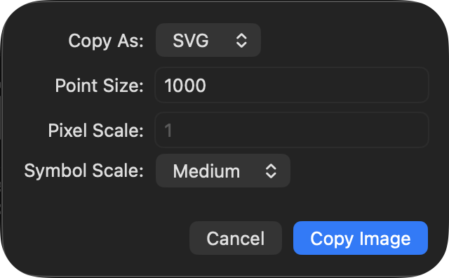
Save as svg file: Right click on the symbol, select “Copy Image As”, then choose “SVG”, set “Point Size” to 1000 to get a high resolution svg file. Click “Copy Image”, go to Finder, ⌘+V to paste the svg to the current folder.
In your document, insert the svg file as needed. E.g., if you have saved the svg file as info.circle.svg in the images folder, use the following code to include the icon:
<img src="{{site.baseurl}}/images/info.circle.svg" alt="" style="display: inline; height: 1.5em; vertical-align: middle;" />
It will show an info circle icon: 
Advanced usage: You can use SF Symbols toghether with ICON Composer, which allows you to create Liquid Glass icons.
CSS
CSS is the language we use to style a Web page.
A CSS rule consists of a selector and a declaration block. Declaration block enclosed by {}.
/* This is a comment */ defines a comment in CSS.
Note that // is not a valid comment in CSS. It will be treated as an invalid declaration and ignored by the browser.
However, you can use // in SCSS preprocessors like Sass or Less, but not in plain CSS.
E.g. all <p> elements will be center-aligned, with a red text color:
/* This is a comment */
p {
  color: red; /* This is a property: value definition; seperated by semicolons */
  text-align: center;
}
/* This is
a multi-line
comment */
Use variable to assign values in CSS:
var(--variable-name, fallback-value) is a function that retrieves the value of a CSS variable. If the variable is not defined, it uses the fallback value provided as the second argument.
You can define CSS variables within a selector, typically in the :root selector to make them global:
/* Syntax */
var(--variable-name, fallback-value)

/* Example */
:root {
  --main-bg-color: #222730;
}

body {
  background-color: var(--main-bg-color, lightblue);
}
This example sets the background color of the body using a CSS variable --main-bg-color. If the variable is not defined, it falls back to lightblue.
Note that custom properties (CSS variables) are case-sensitive and must be prefixed with two hyphens (--).
Another example
/* Define custom CSS variables in the :root selector for global scope */
:root {
  --main-bg-color: #222730;
  --main-text-color: #cae1f4;
}

/* Then you can use these variables throughout your CSS */
body {
  background-color: var(--main-bg-color);
  color: var(--main-text-color);
}
SCSS vs. CSS variables
SCSS variables are defined using the $ symbol and are processed at compile time. They cannot be changed dynamically in the browser.
Use example
/* SCSS variable */
$main-bg-color: #222730;

body {
  background-color: $main-bg-color;
}
After compilation, the output CSS will be:
body {
  background-color: #222730;
}
The variable $main-bg-color no longer exists anywhere.
By contrast, CSS variables are defined using the -- syntax and can be accessed and modified at runtime in the browser. Runtime means that variables lives in the CSS delivered to the browser, and the browser resolves it while rendering the page. You can even change the value of a CSS variable using JavaScript on the fly.
Q: When I use Dark Reader extension, how can I check the variable values used in the page?
body {
  /* text color */
  color: var(--darkreader-text--fgColor-default, var(--darkreader-text--color-fg-default));
  /* background color */
  background-color: var(--darkreader-bg--bgColor-default, var(--darkreader-bg--color-canvas-default));
}
A: Use Web Inspector, go to the Elements tab, then in the Styles pane, scroll down to the bottom to find a list of variable definitions. Alternatively, you can hover over the variable name in the Styles pane to see its value in a tooltip.
-
“Copy declaration” will copy the property and its values. It won’t copy the selector.
E.g.,
color: var(--darkreader-text--fgColor-default, var(--darkreader-text--color-fg-default)); -
“Copy rule” will copy the whole block of CSS rules including that element.
It can get quite long if there are many properties defined for that element.
E.g.,
body {
  color: var(--darkreader-text--fgColor-default, var(--darkreader-text--color-fg-default));
  background-color: var(--darkreader-bg--bgColor-default, var(--darkreader-bg--color-canvas-default));
  ...
}
Selector
CSS selectors are used to “find” (or “select”) the HTML elements you want to style. Can select elements based on name, id, class, etc.
| Selector | Example | Example description |
|---|---|---|
| #id | #firstname | Selects the element with id=”firstname” |
| .class | .intro | Selects all elements with class=”intro” |
| element.class | p.intro | Selects only <p> elements with class=”intro” |
| * | * | Selects all elements |
| element | p | Selects by element names. This selects all <p> elements. |
| element, element, .. | div, p | Selects all <div> elements and all <p> elements. Elements 之间用逗号隔开。 |
Type Selector
A type selector is sometimes referred to as a tag name selector or element selector because it selects an HTML tag/element in your document.
Syntax:
element { style properties }
-
element namebased on the element name.span { background-color: red; }highlight all
<span>elements in red. -
element1, element2grouping selector, separated by comma./* define style for h1, h2, and p elements */ h1, h2, p { text-align: center; color: red; }
ID Selector
An ID selector selects an element based on its ID attribute. ID is case-sensitive and begins with #. It is used similarly as a class selector. The difference is that
- an ID can be used only once per page, and elements can only have a single
idvalue applied to them. - an class begins with
., can be used multiple times per page, and elements can have multiple classes
For example, #toc will select the element that has the ID toc. Please note that this selector only works if the value given in the selector matches the element’s ID attribute exactly.
Syntax:
#idname { style properties }
-
#iduses theidattribute of an HTML element. To select an element with a specific id, write a hash (#) character, followed by the id of the element.#para1 { text-align: center; color: red; }Example: Change the color and alignment of the element with the id
hubspot.<head> #hubspot { color:orange; text-align:right; } </head> <body> <h1 id = "hubspot"> #id selector</h1> <body>
Class Selector
The case-sensitive class selector starts with a dot (.) character. It will select everything in the document with that class applied to it.
Syntax
.classname { style properties }
-
.classGeneral class selector that can be applied to any HTML element.To select elements with a specific class, write a period (
.) character, followed by the class name.<head> .center { text-align: center; color: red; } /* only <p> elements with class="center" will be red and center-aligned: */ p.center { text-align: center; color: red; } </head><body> <!-- <p> element will be styled according to class="center" and to class="large" --> <p class="center large">This paragraph refers to two classes.</p> </body> -
Targeting classes on particular elements
You can create a selector that will target specific elements with the class applied. For instance, a
<span class="highlight">can have different highlight behavior from<h1 class="highlight">. We do this by using the type selector for the element we want to target, with the class appended using a dot, with no white space in between.<html> <head> <style> span.highlight { background-color: #996515; } h1.highlight { background-color: #FF00FF; } </style> </head> <body> <span class="highlight">This text is highlighted in yellow.</span> <h1 class="highlight">This heading is highlighted in pink.</h1> </body> </html>Will be rendered as:
This text is highlighted in yellow.
This heading is highlighted in pink.
-
Apply multiple classes to an element
Multiple classes can be applied to a single element in HTML. Then the classes can be either styled individually using
.class_1and.class_2or that element could be styled only that contains both of the classes using.class_1.class_2. This is called “multiple class selectors”.Basic syntax:
<style>
  .class_1 {
    /* some styles, specify independently */
    font-size: larger;
    margin-bottom: 35px;
    background-color: lightgreen;
  }

  .class_2 {
    /* some styles */
    color: red;
  }

  .class_1.class_2 {
      /* or specify simultaneously */
   	  /* note that there is no space between the class names */
  }
</style>

<body>
  <!-- 调用两个class的时候用空格隔开 -->
  <p class="class_1 class_2"> Hello there </p>
</body>
Use example:
<div class="notebox">This is an informational note.</div>

<div class="notebox warning">This note shows a warning.</div>

<div class="notebox danger">This note shows danger!</div>

<div class="danger">
  This won't get styled — it also needs to have the notebox class
</div>
This is an informational note.This note shows a warning.This note shows danger!This won't get styled — it also needs to have the notebox class -
Pseudo-class Selector
A pseudo-class selector applies CSS to a selected element or elements only when in a special state. For example,
:hoverwill only style an element when a user hovers over it.Other common examples are
:active(when the link/button is being clicked),a:visited(when the link is being visited), andinput:focus: Selects the element that gets focus; triggered when the user clicks or taps on an elements or selects it with the keyboard’stabkey;input:invalid: targets form elements that fail validation based on their HTML attributes.
The syntax of a pseudo selector is:
selector:pseudo-class { style properties }Example: change the color of links that
a:link: the user hasn’t visited – blue.a:visited: the user has already visited – green.a:hover: when a user hovers over them – fuschia color
<head>
a:link {
  color: blue;
}
a:visited {
  color: green;
}
a:hover {
  color: fuschia;
}
</head>

<body>
<p>So you've already visited <a href="http://hubspot.com">blog.hubspot.com</a>. Why not check out our home site at <a href="http://blog.hubspot.com">hubspot.com</a>?</p>
</body>
CSS Combinators
| Name | Sign | Example | Example Result |
|---|---|---|---|
| Selector list | , | div, p | Selects all <div> elements and all <p> elements |
| Descendant combinator | (single space) | div p | Selects all <p> elements inside <div> elements |
| Child combinator | > | div > p | Selects every <p> element that are direct children of a <div> element |
| Namespace separator | | | ns | h2 | Selects all <h2> elements in namespace ns |
| Next-sibling combinator | + | div + p | Selects the first <p> element that is placed immediately after <div> elements |
| Subsequent-sibling combinator | ~ | p ~ ul | Selects all <ul> elements that are preceded by a <p> element |
Q: What is a direct child?
A: Elements immediately nested inside the parent element.
Group Selector
You could combine different types of selectors into a selector list. To create a selector list, you just have to list multiple selectors and separate them by commas (,). The properties you defined will apply to all of the individual selectors.
You can group different types of selectors together, including element selectors, class selectors, id selectors, and more.
For example, if you have the same CSS for an element selectorh2 and also a class selector of .spacious, then in stead of writing two separate rules, you can combine these into a selector list, by adding a comma between them.
/* define the selectors separately */
h2 {
  color: green;
}
.spacious {
  color: green;
}
/* equivalently, you can define a selector list */
h2, .spacious {
  color: green;
}
You can also place selectors on their own line if that makes the code easier to read.
/* more readable if each selector on its own line */
h2,
.spacious {
  color: green;
}
Descendant Selectors
Match an element that is a descendant of another element.
This uses two separate selectors, separated by a space (␣).
selector1 selector2 {
  /* property declarations */
}
selector1 is the ancestor/parent. selector2 is the descendant. selector2 is selected only if it has an ancestor matching selector1.
For example, if we wanted all emphasized text in our paragraphs to be green text, we would use the following CSS rule:
p em { color: green; }
Ex2
<head>
<style>
/* List items that are descendants of the "my-things" list */
/* This way, you can create bullet lists with different styles, e.g, multiple-choice, regular bullet lists. */
ul.my-things li {
  margin: 2em;
  color: green;
}
</style>
</head>
<body>
<ul class="my-things">
  <li>apple</li>
  <li>orange</li>
</ul>
</body>
The user defined list would look like the following
- apple
- orange
Child Selector
A child selector selects elements that are direct children of a specified element.
selector1 > selector2 {
  /* property declarations */
}
selector1 is the parent. selector2 is the child. selector2 is selected only if it has a parent matching selector1.
Use example:
blockquote > p {
    color: darkslategray;
    margin-bottom: 1em;
  }
<blockquote>
  <p>This is a direct child of blockquote. </p>

  <p>This is another direct child.</p>

  <div>
    <p>This is a grandchild of blockquote, because it’s inside a div. This one will NOT be styled.</p>
  </div>
</blockquote>
If you want to select all <p> elements inside a <blockquote>, regardless of how deeply nested they are, you would use the Descendant Selector instead:
blockquote p {
  color: darkslategray;
  margin-bottom: 1em;
}
Adjacent Sibling Selector
An adjacent sibling selector selects an element that is immediately preceded by a specified element.
selector1 + selector2 {
  /* property declarations */
}
selector1 is the previous sibling. selector2 is the next sibling. selector2 is selected only if it has a previous sibling matching selector1.
Use example:
h2 + p {
  color: blue;
}
This will select the first <p> element that immediately follows an <h2> element, and apply the color blue to it.
<h2>Heading</h2>
<p>This paragraph is immediately after the heading and will be blue.</p>
<p>This paragraph is not immediately after the heading and will not be blue.</p>
Example 2
<style>
  blockquote p + p {
    margin-top: 1em; /* Adjust as needed */
  }
</style>
blockquote p + ptargets every<p>that directly follows another<p>inside a<blockquote>.margin-top: 1emadds vertical spacing between them without affecting the first paragraph.
Attribute Selector
An attribute selector selects all elements that have a given attribute or an attribute set to a specific value.
a[target] ([attribute]): Selects all <a> elements with a target attribute:
a[target] {
  background-color: yellow;
}
a[target="_blank"]([attribute="value"]): Selects all <a> elements with a target="_blank" attribute:
a[target="_blank"] {
  background-color: yellow;
}
[title~="flower"]([attribute~="value"]): Selects all elements with a title attribute that contains a space-separated list of words, one of which is “flower”.
[title~="flower"] {
  border: 5px solid yellow;
}
The example above will match elements with title=”flower”, title=”summer flower”, and title=”flower new”, but not title=”my-flower” or title=”flowers”.
Universal Selector
*selects all HTML elements on the page.
/* affect every HTML element on the page: */
* {
  text-align: center;
  color: blue;
}
Case Sensitiveness
In short, some are case-sensitive, some are not.
Sensitive:
-
Selectors. The HTML elements, classes, and IDs that you reference in your CSS file are case-sensitive.
For example, if you have an element with
id="example", you must reference it in your CSS file as#exampleand not#Example.
Insensitive:
-
Properties.
E.g.,
background-colorandBackGround-COLORare considered the same. That being said, it is recommended to use lowercase for property names to maintain readability and consistency. -
Property Values. In general, property values are case-insensitive, except for font names and URLs.
So,
redandREDare considered the same color.However, the values of the
font-family,url, andattrare case-sensitive.
Style Sheet
There are three ways of inserting a style sheet:
- External CSS — by using a
<link>element to link to an external CSS file - Internal CSS — by using a
<style>element in the<head>section - Inline CSS — by using the
<style>attribute inside HTML elements
-
With an external style sheet, you can change the look of an entire website by changing just one file!
Each HTML page must include a reference to the external style sheet file inside the <link> element, inside the head section.
<!DOCTYPE html> <html> <head> /* example of external CSS */ <link rel="stylesheet" href="mystyle.css"> </head> <body> <h1>This is a heading</h1> <p>This is a paragraph.</p> </body> </html> -
An internal style sheet may be used if one single HTML page has a unique style.
The internal style is defined inside the
<style>element, inside the head section.<!DOCTYPE html> <html> <head> <style> body { background-color: linen; } h1 { color: maroon; margin-left: 40px; } </style> </head> <body> <h1>This is a heading</h1> <p>This is a paragraph.</p> </body> </html> -
An inline style may be used to apply a unique style for a single element.
<!DOCTYPE html>
<html>
<body>

<h1 style="color:blue;text-align:center;">This is a heading</h1>
<p style="color:red;">This is a paragraph.</p>

</body>
</html>
@import allows you to import a style sheet into another style sheet.
- The
@importrule must be at the top of the the stylesheet, before any other at-rule (but after any@charsetand@layer) and style declarations. Otherwise it will be ignored.
Syntax:
@import url("navigation.css"); /* Using a url */
@import "navigation.css"; /* Using a string */
urlis a<string>or a<url>type representing the location of the resource to import. The URL may be absolute or relative.
Developer Tool
Right-clicking Inspect Element is your good friend. Say you say on a website something really appealing, and you want to use the same styling in your website, right click and see its CSS.
-
One neat thing about the developer tools is that you can click and temporarily edit the CSS properties in this very window and simultaneously see the changes take effect on the page. These edits only happen in your browser, so nothing in your R Markdown document will change (in fact, your edits will be lost as soon as you refresh the page in your browser), but editing here is a fast way to test out any CSS ideas.
-
Another thing you can do is to pull up your site and change the attributes using the developer tool. It allows you to have a sense of how your site would look like after the changes have taken effect.
Note that these edits only happen in your browser, so nothing in your Rmd document will change (in fact, your edits will be lost as soon as you refresh the page in your browser), but editing here is a fast way to test out any CSS ideas.
Change color
If you don’t see the color changing on your site, then it means you either have the wrong selector OR it means that something else is overriding your color choice (a strikethrough line means sth is overridden). You can force it to go with your choice by adding !important to the end of line you added, right before the ;.
Note: NO comma between !important and the value.
.navbar {
  background-color: #fcfcfc !important;
}
Cross references
Link within the same document
-
If it is a heading
[click on this link](#my-multi-word-header)

### My Multi Word Header
Note that if you use the default markdown tag for headings, you need to make sure the link text matches the heading text exactly, with spaces replaced by hyphens (
-), and all letters in lowercase.It is a headache to remember the rules and this approach is brittle, because if you change the heading text, the link will break.
✅ A recommended way is to add a custom id
{#my-custom-id}to the heading.The benefits are:
- don't need to worry about spaces or special characters in the heading text;
- when you change the heading text, the link still works (more robust).
### My Multi Word Header {#my-custom-id}

[click on this link](#my-custom-id)
The HTML way to define a heading with a specific id: ✅
(I personal think this is the most robust way of referencing headings)<a id="my-custom-id"></a> ### My Multi Word Header [click on this link](#my-custom-id)Note that a blank line is required between the
<a>tag and the heading for the heading to render correctly. Otherwise, the heading will NOT be recognized as a heading.<a name="my-custom-id">is equivalent to<a id="my-custom-id">for defining a named anchor.idandnameare interchangeable in this case. -
If it is common text (the HTML way)
This the the source to be linked to (where you define the link id): <a name="tag-here">Common Text</a>

This is the Markdown way to cross reference: [Link text](#tag-here)

Alternatively, you can use the HTML way: <a href="#tag-here">Link text</a>
Or you can use
<a id="tag-here">Common Text</a>to define a named anchor.
定义 HTML 标签时,
id和name是没有#的。
引用标签时,必须要在id和name前加#。HTML 和 Markdown 方式都可以定义和引用标签,并且可以混用,及用 HTML 定义标签,用 Markdown 引用标签,反之亦然。
个人推荐用 HTML 定义标签,Markdown 引用。感觉这样语法最简单。✅
Refer to Markdown: Cross References for more examples.
Refer to another document
For links across files, the HTML file path needs to be included, with the site root url enclosed in double curly braces as follows:
<a href="{{site.baseurl}}/2023/10/04/Markdown.html#cross-references">Markdown: Cross References </a> for more examples.
Bullet list
<ol style="list-style-type:lower-alpha; line-height:20px">
  <li>Coffee</li>
  <li>Tea</li>
  <li>Milk</li>
</ol>
<!-- alternatively-->
<ol type="a">
  <li>Coffee</li>
  <li>Tea</li>
  <li>Milk</li>
</ol>
Shows the following list:
- Coffee
- Tea
- Milk
Define your own label, e.g., add parentheses around numbering.
References: https://stackoverflow.com/a/76027284/10108921
@counter-style paren-lower-alpha {
  system: extends lower-alpha;
  suffix: ") ";
}
@counter-style paren-decimal {
  system: extends decimal;
  suffix: ") ";
}
@counter-style paren-lower-roman {
  system: extends lower-roman;
  suffix: ") ";
}
[type="pa"] {
  list-style: paren-lower-alpha;
}
[type="p1"] {
  list-style: paren-decimal;
}
[type="pi"] {
  list-style: paren-lower-roman;
}
Parenthesized decimal 1):
<ol type="p1">
    <li>Sublist first.</li>
    <li>Sublist second.</li>
</ol>
show the following
- Sublist first.
- Sublist second.
Parenthesized letter a):
<ol type="pa">
    <li>Sublist first.</li>
    <li>Sublist second.</li>
</ol>
show the following
- Sublist first.
- Sublist second.
Parenthesized roman i):
<ol type="pi">
    <li>Sublist first.</li>
    <li>Sublist second.</li>
</ol>
show the following
- Sublist first.
- Sublist second.
Start numbering at a specific number (other than 1):
<ol start="5">
  <li>Coffee</li>
  <li>Tea</li>
  <li>Milk</li>
</ol>
show the following list starting at 5:
- Coffee
- Tea
- Milk
MarkedJS provides support for extended ordered list. See documentation HERE.
ref: https://html.spec.whatwg.org/multipage/grouping-content.html#the-ol-element
Nested bullet list. <ol> (<ul>) is a child of the <li> it belongs to.
<ol>
<li> Accept the invitation from FactSet. </li>
<li>  Whitelist your IP address. </li>
<li>  Install Microsoft ODBC SQL driver. </li>
<li>  Install Azure Data Studio to connect to the SQL database.
   <ol type="pa">
   <li> Alternatively, could use Python Programmatic Access. Need to install `pyodbc` to manage the connection. </li>
   <ol>
</li>
</ol>
- Accept the invitation from FactSet.
- Whitelist your IP address.
- Install Microsoft ODBC SQL driver.
- Install Azure Data Studio to connect to the SQL database.
- Alternatively, could use Python Programmatic Access. Need to install `pyodbc` to manage the connection.
Unordered nested bullet list:
<ul>
  <li>Coffee</li>
  <li>Tea
    <ul>
      <li>Black tea</li>
      <li>Green tea</li>
    </ul>
  </li>
  <li>Milk</li>
</ul>
- Coffee
- Tea
- Black tea
- Green tea
- Milk
line-height:120% 行间距
| Values | Meaning |
|---|---|
| number | A number that will be multiplied with the current font-size to set the line height |
| length | A fixed line height in px, pt, cm, etc. |
| % | A line height in percent of the current font size |
Tables
Each table cell is defined by a <td> and a </td> tag, stands for table data.
Table headers use <th> tag instead of the <td> tag.
Each table row starts with a <tr> and ends with a </tr> tag, stands for table row.
-
Add border-bottom to table row using
style="border-bottom: 1pt solid black;"3 arguments:
<border-width><border-style><border-color>.Add
<table style="border-collapse: collapse;">to your table rule when you want all borders for your table. Otherwide, tables will have double-lined borders.
The default behavor for html tables is no borders. If you specify individual borders mannually, still needborder-collapse: collapse.Col 1 Col 2 Col 3 A1 B1 C1 A2 B2 C2 A2 B2 C2 <table style="border-collapse: collapse; table-layout:fixed; width:60%; margin-left: auto; margin-right: auto;"> <tr style="border-bottom: 1pt solid #D3D3D3;"><th>Col 1</th><th>Col 2</th><th>Col 3</th></tr> <tr><td>A1</td><td>B1</td><td>C1</td></tr> <tr><td>A2</td><td>B2</td><td>C2</td></tr> <tr><td>A2</td><td>B2</td><td>C2</td></tr> </table>
<table> attributes
border-spacingproperty sets the distance between the borders of adjacent cells.width: 100%Set the width of the table.max-width: 100%; white-space: nowrap;prevent the text from wrapping.margin-left: auto; margin-right: auto;center-align the table.table-layout: auto|fixed|initial|inherit;property defines the algorithm used to lay out table cells, rows, and columns.-
auto: Default value. Browsers use an automatic table layout algorithm.The browser analyzes all cells in a column and calculates the optimal width for each column dynamically based on the longest unbreakable content.
Auto table layout dynamically adjusts column widths based on content, offering flexibility for diverse data lengths but can lead to less predictable table dimensions.
-
fixedsets a fixed table layout algorithm. This makes table render fast.The table and column widths are set by the widths of table and col or by the width of the first row of cells. Cells in other rows do not affect column widths.
If no widths are present on the first row, the column widths are divided equally across the table, regardless of content inside the cells.
On large tables, users will not see any part of the table until the browser has rendered the whole table. So, if you use
table-layout: fixed, users will see the top of the table while the browser loads and renders rest of the table.
-
initial: Sets this property to its default value.inherit: Inherits this property from its parent element.
<td>/<th> attributes for cells and headers
-
<td><div style='width: 150px;'>Text to break here</div></td>let you fix the width of the column containing the cell at 150px.- If a percentage is used, then it means the proportion of its parent element.
-
colspan=2span the width of more than one cell or column.- center the text
<td colspan="2" style="text-align:center;" >Center on two cols</td>
- center the text
-
rowspan=2span the height of more than one cell or row.不能放在 style 里面,必须以
property-key=value的形式赋值,行数可以放在引号内 (rowspan="2"),也可以不要引号。 -
text-align: center | left | right- By default, the content of
<th>elements are center-aligned and - the content of
<td>elements are left-aligned.
- By default, the content of
-
vertical-align: top | bottom | middlevertical alignment -
paddingCell padding is the space between the cell borders and its content.By default the padding is set to 0. That is, cells are only as large as their content requires by default.
-
border-spacingCell spacing is the space between each cell.By default the space is set to 2 pixels.
Change column width
<colgroup> specifies a group of one or more columns in a table for formatting.
Set each col to be 250px wide.
Put the <colgroup>...</colgroup> below <table> and above table data <tr>.
<colgroup style="width: 150px;">
  <col>
  <col>
  <col>
</colgroup>
| Col 1 | Col 2 | Col 3 |
|---|---|---|
| A1 | B1 | Name: Anna Fitzgerald Job Title: Staff Writer Email address: example@company.com |
| A2 | B2 | C2 |
| A2 | B2 | C2 |
Set width for one column to be 300px.
<colgroup>
  <col>
  <col>
  <col style="width:300px">
</colgroup>
| Col 1 | Col 2 | Col 3 |
|---|---|---|
| A1 | B1 | Name: Anna Fitzgerald Job Title: Staff Writer Email address: example@company.com |
| A2 | B2 | C2 |
| A2 | B2 | C2 |
Zebra stripes
In css, specify the following properties.
tr:nth-child(even) {
  background-color: rgba(150, 212, 212, 0.4);
}

th:nth-child(even),td:nth-child(even) {
  background-color: rgba(150, 212, 212, 0.4);
}
border property works on table, th, and td elements:
-
To avoid having double borders, set the CSS
border-collapseproperty tocollapse. -
border: width style color;it is a shorthand for the following three CSS properties:The
borderproperty may be specified using one, two, or three of the values listed below. The properties will be automatically recognized and matched with corresponding properties.Separate by space, the order does not matter.
Try html table yourself
-
Paste html code and generate tables: https://www.w3schools.com/html/tryit.asp?filename=tryhtml_table_intro
-
For styling: https://divtable.com/generator/
-
Table converter (from LaTex to html and more): https://tableconvert.com/latex-to-markdown
Table with headers:
| Company | Contact | Country |
|---|---|---|
| Alfreds Futterkiste | Maria Anders | Germany |
| Centro comercial Moctezuma | Francisco Chang | Mexico |
Table without headers:
| submission | March 15 |
| Feedback | April 15 |
- To center a table, add
margin-left:auto; margin-right:auto;to thestyleattribute in the<table>tag.
Code
-
Code blocks: the
<pre>and<code>tags.The
<pre>tag is a block level element that defines preformatted text. It preserves both spaces and line breaks in the code, making it ideal for displaying computer code. The content inside is displayed in the browser’s default monospace font.The
<code>tag, on the other hand, is used for inline code within a paragraph or line of text.An example:
<pre><code> function hellowWorld(){ print ("Hello, World!") } </code></pre><pre>is different from<p>, which is a paragraph tag
-
Inline code:
<code> -
<kbd>define keyboard input/* Add border to <kbd> element: */ <style> kbd { border-radius: 2px; padding: 2px; border: 1px solid black; } </style>Example:
- Press Ctrl + C to copy text (Windows).
- Press Cmd + C to copy text (Mac OS).
Inline code that spans multiple lines: use white-space: pre and then for indentation.
<code style="white-space: pre; display: inline;">scale_x_continuous(name = waiver(),
breaks = waiver(),
minor_breaks = waiver(),
n.breaks = NULL,
labels = waiver(),
limits = NULL,
expand = waiver(),
oob = censor,
na.value = NA_real_,
trans = "identity",
guide = waiver(),
position = "bottom",
sec.axis = waiver()
)</code>
Will show as:
scale_x_continuous(name = waiver(),
    breaks = waiver(),
    minor_breaks = waiver(),
    n.breaks = NULL,
    labels = waiver(),
    limits = NULL,
    expand = waiver(),
    oob = censor,
    na.value = NA_real_,
    trans = "identity",
    guide = waiver(),
    position = "bottom",
    sec.axis = waiver()
)
Benefits:
- compact
- preserve indentation and line breaks
Q: Sometimes a line is very long, how to wrap up code in code blocks?
A: Use CSS to style it as follows.
<style>
  pre {
    white-space : pre-wrap !important;
    word-break: break-word;
  }
</style>
white-space: pre-wrap soft-line wrap inside code blocks.
word-break: break-word will avoid breaking the words across lines.
// This is a long cmd, with soft wrap
xtabond n l(0/1).ys yr1980-yr1984 year, lags(2) twostep pre(w, lag(1,.)) pre(k, lag(2,.)) noconstant vce(robust)
Disable auto wrapping for code blocks
Sometimes you may want to disable word wrap for certain code blocks, e.g, output from software. If you force soft wrap, the structure will be broken, making it hard to read. In this case, you can define a class .nowrap as follows.
/* code block: do not wrap */
pre.nowrap {
  white-space: pre !important;
}
Wrap your code block with <pre class="nowrap"><code>...</code></pre> to disable soft wrap.
Use example:
<pre class="nowrap"><code>
// This s a long cmd, disable soft wrap
xtabond n l(0/1).ys yr1980-yr1984 year, lags(2) twostep pre(w, lag(1,.)) pre(k, lag(2,.)) noconstant vce(robust)
</code></pre>
// This s a long cmd, disable wrap
xtabond n l(0/1).ys yr1980-yr1984 year, lags(2) twostep pre(w, lag(1,.)) pre(k, lag(2,.)) noconstant vce(robust)
If you don’t want to define a new class, you may specify inline style as follows.
<pre style="white-space: pre !important;"><code>
// This s a long cmd, disable soft wrap
xtabond n l(0/1).ys yr1980-yr1984 year, lags(2) twostep pre(w, lag(1,.)) pre(k, lag(2,.)) noconstant vce(robust)
</code></pre>
// This s a long cmd, disable wrap
xtabond n l(0/1).ys yr1980-yr1984 year, lags(2) twostep pre(w, lag(1,.)) pre(k, lag(2,.)) noconstant vce(robust)
A quick workaround is to quote your codeblocks.
Code inside quote looks like:
this line is very very very very very very very very very very very very very very very very very very very very very very very very very very very very very very very very very very very very long
Use the following code:
> ```
> this line is very long …
> ```
Q: Why my block code is smaller than inline code? Here is my CSS:
code,
pre {
    font-family: Consolas, "Source Code Pro", "Liberation Mono", Menlo, Courier, monospace;
    font-size: 0.9em;
}
A: It is due to the double-scalling. <pre> is set to 0.9 em <code> inside <pre> inherits that and also gets its own 0.9 em. Result: effective font-size is 0.9 × 0.9 = 0.81 em .
Q: How to fix it?
A: To avoid double-scaling, you should target pre code specifically and set the size only once:
pre,
code {
    font-family: ...;
}

pre code {
    font-size: 0.9em;
}

code:not(pre code) {
    font-size: 0.9em; /* for inline code */
}
Alternatively, you can let the <code> inside <pre> just inherit the font size from <pre> without applying another scale.
pre,
code {
    font-family: ...;
    font-size: 0.9em;
}
pre code {
    font-size: inherit;
}
white-space
The white-space property specifies how white-space inside an element is handled.
white-space: normal | pre-wrap | pre | pre-line | nowrap | initial | inherit;
| Value | Description |
|---|---|
normal |
Default value. Sequences of whitespace will collapse into a single whitespace. Text will wrap when necessary. |
pre |
Whitespace is preserved exactly by the browser. Text will only wrap on line breaks. Acts like the <pre> tag (for source code blocks) in HTML. |
pre-wrap |
Whitespace is preserved by the browser. Text will wrap when necessary, and on line breaks. |
pre-line |
Sequences of whitespace will collapse into a single whitespace. Text will wrap when necessary, and on line breaks. |
nowrap |
Sequences of whitespace will collapse into a single whitespace. Text will never wrap to the next line. The text continues on the same line until a <br/> tag is encountered. 文本不会换行,文本会在同一行上继续,直到遇到 <br/> 标签为止。 |
initial |
Sets this property to its default value. |
inherit |
Inherits this property from its parent element. |
Most often used values are pre, and no-wrap.
preuseful for code blocks that contains multi-lined regression output. This will preserve all whitespaces exactly, won’t collapse your spaces for instance.no-wrapwill collapse spaces into one. Useful for inline code.
word-break
The word-break property specifies how words should break when reaching the end of a line.
word-break: normal|break-word|break-all|keep-all|initial|inherit;
| Value | Description |
|---|---|
normal |
Default value. Uses default line break rules. |
break-word |
Deprecated. To prevent overflow, words may be broken at arbitrary points. |
break-all |
To prevent overflow, words may be broken at any character. |
keep-all |
Word breaks should not be used for Chinese, Japanese, or Korean (CJK) text.
Non-CJK text behaves the same as normal.
|
Footnote
Markdown does not have explicit footnote support, so I use HTML* instead. Personally, I prefer using * or † for
footnote markers, but you can use numbered[1] markers if you really want.
* This is the footnote text
[1] Number them any way you like
Markdown does not have explicit footnote support, so I use
HTML<sup>*</sup> instead. Personally, I prefer using `*` or `†` for
footnote markers, but you can use numbered<sup>[1]</sup> markers if
you really want.

<sup>*<sub> This is the footnote text</sub></sup>
<sup>[1]<sub> Number them any way you like</sub></sup>
Recommended practice:
- Use
<sup>1</sup>for the footnote references. Using numbers is a lot easier to remember than a list of symbols, and looks nicer, since their heights will always be equal (as opposed to*and†, for example). - Use a horizontal line to separate the footnotes section, making it clear that it’s not just a continuation of the body.
- Use a
<sup>tag to render the footnote definitions in small text, again making it clear that it’s a footnote section. Don’t use<sub>as it won’t wrap as nicely. - Use a second
<sup>tag for each number in the footnote section, again making it clear that it’s a footnote definition and not part of the body. - Use double spaces to separate footnote lines, so that the definition numbers line up.
In typography, a reference relating to the main body of text, positioned at the bottom of the page. Footnotes are referenced by certain symbols (*, †, ‡, etc.), letters, or numbers, most often in superscript form.
The most common sequence of footnote reference marks is: 1. asterisk (*), 2. dagger (†), 3. double dagger (††), 4. paragraph symbol (¶), 5. section mark (§), 6. parallel rules (||), 7. number sign (#).
If more are required, they can be doubled up: double asterisks (**), double single daggers (††), double double daggers (††††), etc. However, when many footnotes are used, it is more practical to use consecutive numbers to identify each footnote.
Typesetting:
-
A footnote begins on the same page as its reference call, but it may be carried over to the bottom of successive pages.
-
A short rule or additional space should separate the footnote from the text.
- The first line of each footnote is normally slightly indented.
- Point sizes for footnotes are usually 7- or 8-point, smaller than the text size.
Scrollbar
https://developer.mozilla.org/en-US/docs/Web/CSS/::-webkit-scrollbar
-
::-webkit-scrollbar— the entire scrollbar.You can change the width of the scrollbar.
-
::-webkit-scrollbar-thumb— the draggable scrolling handle.The height of the handle is calculated automatically based on the length of your page contents. When your page is long, the handle will be short; when your page is short, the handle will be long.
To fix the original scrollbar is invisible on some website, use the following css to change its color
::-webkit-scrollbar-thumb {
  background-color: #424242 !important;
  border: 1px solid #424242;
  border-radius: 50px;
}
/* Handle on hover */
::-webkit-scrollbar-thumb:hover {
  background: #555;
}
::-webkit-scrollbar {
  background-color: transparent !important;
  width: 10px;
}
/* Track (background bar) on hover */
::-webkit-scrollbar-track:hover {
  background: #666666;
}
/* corner where horizontal and vertical scrollbars meet */
::-webkit-scrollbar-corner {
    background: transparent;
}
::-webkit-scrollbar-button— the buttons on the scrollbar (arrows pointing upwards and downwards that scroll one line at a time).::-webkit-scrollbar-track— the track of the scrollbar. The whole column containing the scrollbar.::-webkit-scrollbar-corner— the bottom corner of the scrollbar, where both horizontal and vertical scrollbars meet. This is often the bottom-right corner of the browser window.
overflow: scroll | auto;
scrollAlways show a scroll bar.autoOnly display scroll bars if the content is overflowing.
Fix height of a div
You can set a fixed height for a <div> element and enable vertical scrolling when the content exceeds that height.
<div style="height: 400px; overflow-y: auto;" markdown="1">
  Your content here...
</div>
Fix height of an image with vertical scrollbar:
<!-- Example: fixed height div with vertical scrollbar -->
<div style="height: 400px; overflow-y: auto;">
<img src="https://drive.google.com/thumbnail?id=1OhFkDxurkwJG5AsMwiIN_esJcjrbH3WU&sz=w1000" alt="" style="display: block; margin-right: auto; margin-left: auto; zoom:40%;" />
</div>
FAQ
Q: How to write markdown inside html tags?
A: Use <div markdown="1"> ... </div> to wrap the markdown content.
<div class="my-class" markdown="1">
**This will not be bold**
</div>
Then the content inside the <div> will be parsed as markdown.
Otherwise, markdown syntax inside html tags will NOT be rendered.
Only certain HTML tags support markdown parsing (markdown="1" attribute), including <div>, <section>, and <article>.
You cannot use <p>, <span>, <u>, etc.
Note that you can have html tags inside markdown.
**<u>This will be bold</u>**
shows as This will be bold (bold and underlined).
But
<u>**This won't be bold.**</u>
shows as **This won't be bold.** (only underlined, NOT bold).