7.6 plot Raster data
geom_rect() and geom_tile() do the same thing, but are parameterised differently: geom_rect() uses the locations of the four corners (xmin, xmax, ymin and ymax), while geom_tile() uses the center of the tile and its size (x, y, width, height).
geom_raster(mapping = NULL, data = NULL, stat = "identity", position = "identity", ..., hjust = 0.5, vjust = 0.5,
interpolate = FALSE, na.rm = FALSE, show.legend = NA,inherit.aes = TRUE) is a high performance special case for when all the tiles are the same size.
# Interpolation smooths the surface & is most helpful when rendering images.
ggplot(faithfuld, aes(waiting, eruptions)) +
 geom_raster(aes(fill = density), interpolate = TRUE)
plot_raster <- function(r, title=NULL,low=50, high=300, unit="$W/m^2$"){
# @param r is a raster
# return a ggplot object
mat <- as.matrix(r)
latMat <- rep.col(seq(from=89.75,to=-89.75,by=-0.5), 720)
lonMat <- rep.row(seq(from=-179.75,to=179.75,by=0.5), 360)
plot_data <- tibble(lat=as.vector(latMat),
lon=as.vector(lonMat),
value=as.vector(mat)
)
p <- ggplot(plot_data, aes(lon, lat)) +
geom_raster(aes(fill=value), interpolate = TRUE, na.rm = TRUE) +
ylim(-60, 90) + # crop latitude extent
scale_fill_gradientn(colours = viridis::viridis(256, option = "C"),
limits=c(50,300), # set limit for legend
space = "Lab",name=TeX(unit),
na.value = NA # remove gray NA values area
) +
labs(title=title) +
theme_minimal() +
theme(axis.title.x = element_blank(),
axis.title.y = element_blank())
return (p)
}geom_tile(x, y, width, height) plots squares, similar to geom_raster(). geom_raster() is a high performance special case for when all the tiles are the same size.
geom_rect(xmin, xmax, ymin and ymax) plots rectangles.
Gradient color scales
* could be either color or fill.
scale_*_gradient creates a two colour gradient (low-high),
scale_*_gradient2 creates a diverging colour gradient (low-mid-high),
scale_*_gradientn creates a n-colour gradient.
scale_*_gradientn(..., colours,values = NULL, space = "Lab",na.value = "grey50", guide = "colourbar",aesthetics = "fill", colors )
...Arguments passed on tocontinuous_scalepaletteA palette function that when called with a numeric vector with values between 0 and 1 returns the corresponding output values (e.g.,scales::area_pal()).breakslabelslimitsoobHow to handle out of bound values- default replace oob values with
NA
- a lambda function
scales::squish()for squishing out of bounds values into range.
- default replace oob values with
coloursVector of colours to use for n-colour gradient.valuesIf colours should not be evenly positioned along the gradient this vector gives the position (between 0 and 1) for each colour in thecoloursvector.guideType of legend. Use"colourbar"for continuous colour bar, or"legend"for discrete colour legend.
Color palette in heat maps—using scale_fill_gradient, scale_fill_gradient2 or scale_fill_gradientn.
scale_fill_gradient setting a lower and a higher color to represent the values of the heat map.
ggplot(df, aes(x = x, y = y, fill = value)) +
  geom_tile(color = "black") +
  scale_fill_gradient(low = "white", high = "red") +
  coord_fixed()
If you want to add a mid color you can use scale_fill_gradient2, which includes the midargument.
you can also use a custom color palette with scale_fill_gradientn, which allows passing n colors to the colors argument.
ggplot(df, aes(x = x, y = y, fill = value)) +
  geom_tile(color = "black") +
  scale_fill_gradient2(low = "#075AFF",
                       mid = "#FFFFCC",
                       high = "#FF0000") +
  coord_fixed()

ggplot(df, aes(x = x, y = y, fill = value)) +
  geom_tile(color = "black") +
  scale_fill_gradientn(colors = hcl.colors(20, "RdYlGn")) +
  coord_fixed()
Categorical map scale_fill_manual()
plot_data <- plot_data %>%
    mutate(trend_decadal = squish(trend_decadal, range = c(0.05+0.0001, 0.4) ),
           cat = cut(trend_decadal, seq(0.05, 0.4, 0.05)),
           cut = factor(cat, levels=rev(levels(cat)) ),
           label = sapply(as.character(levels(plot_data$cat)[plot_data$cat]),
                          function(x) switch(x, "(0.05,0.1]" = 0.1,
                          "(0.1,0.15]" = 0.15,
                          "(0.15,0.2]" = .2,
                          "(0.2,0.25]" = .25,
                          "(0.25,0.3]" = .3,
                          "(0.3,0.35]" = .35,
                          "(0.35,0.4]" = .4) )
           )
world.map <- ne_countries(scale = "medium", returnclass = "sf")
world.map <- world.map %>% left_join(plot_data, by=c("iso_a3_eh"="ISO_C3"))

unit <- "ºC $dec^{-1}$"
p_map3 <- ggplot() +
    geom_sf(data = world.map %>% filter(continent!="Antarctica"), aes(fill=cut), colour='gray50', lwd=0.3 ) +
    coord_sf(datum = NA) +
    labs(title="Temperature decadal trends") +
    scale_fill_manual(values = myColors, breaks=levels(plot_data$cut), name=TeX(unit) ) +
    theme_bw() +
    theme(plot.title = element_text(hjust=0.1) )
p_map3
Discrete value map scale_fill_stepsn, guide_colorsteps change aesthetics.
scale_*_steps creates a two colour binned gradient (low-high), scale_*_steps2creates a diverging binned colour gradient (low-mid-high), and scale_*_stepsn creates a n-colour binned gradient.
Using show.limits=TRUE to specify lengend limits.
The last box in the legend is bigger. This is a bug, you might tweak the breaks a little bit to add/subtract a very small value: breaks = c(-3 + smallvalue, -2:2, 3 - smallvalue)
Binned gradient colour scales
These scales are binned variants of the gradient scale family and works in the same way.
# Define your own colour ramp to extract binned colours from
ggplot(df, aes(x, y)) +
  geom_point(aes(colour = z1)) +
  scale_colour_stepsn(colours = terrain.colors(10))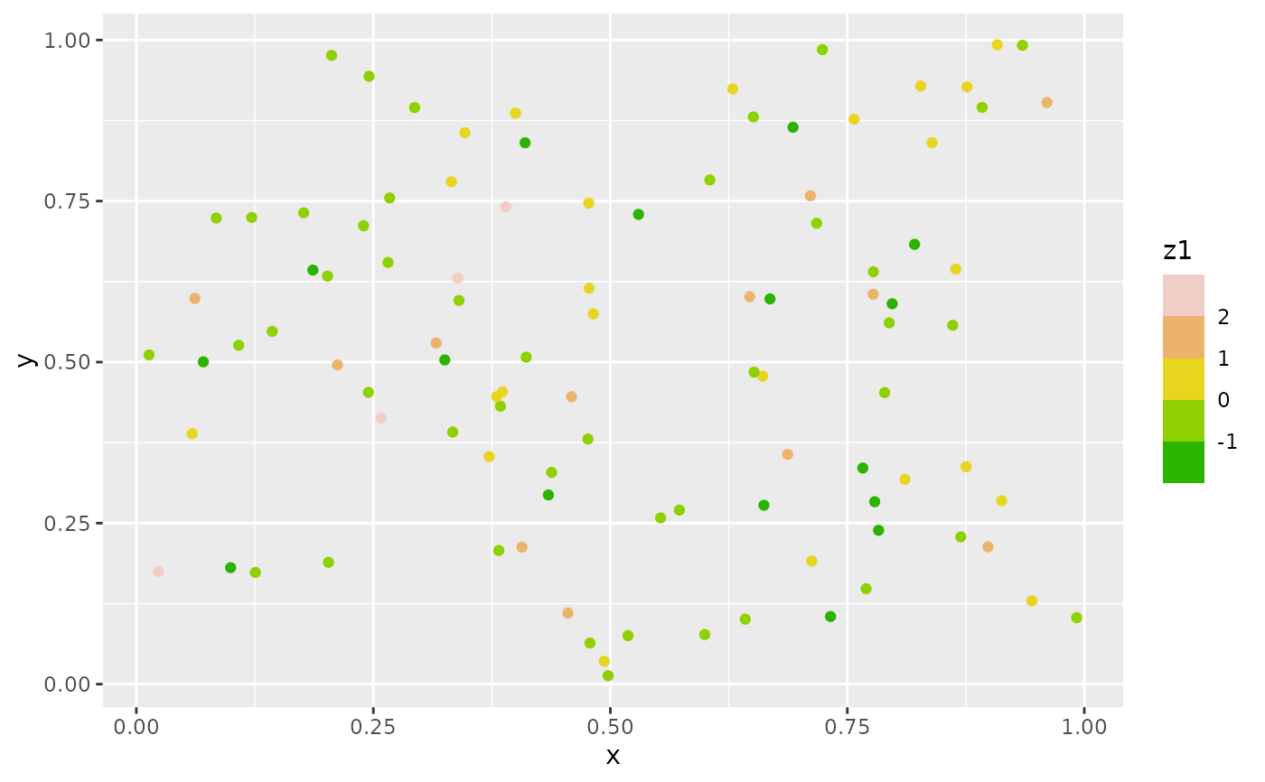
Set breaks for gradient scale
Let mid color be white.
test = matrix(rnorm(200), 20, 10)
test[1:10, seq(1, 10, 2)] = test[1:10, seq(1, 10, 2)] + 3
test[11:20, seq(2, 10, 2)] = test[11:20, seq(2, 10, 2)] + 2
test[15:20, seq(2, 10, 2)] = test[15:20, seq(2, 10, 2)] + 4
colnames(test) = paste("Test", 1:10, sep = "")
rownames(test) = paste("Name", 1:20, sep = "")

paletteLength <- 50
myColor <- colorRampPalette(c("yellow", "white", "blue"))(paletteLength)
# length(breaks) == length(paletteLength) + 1
# use floor and ceiling to deal with even/odd length pallettelengths
myBreaks <- c(seq(min(test), 0, length.out=ceiling(paletteLength/2) + 1),
              seq(max(test)/paletteLength, max(test), length.out=floor(paletteLength/2)))

# Plot the heatmap
pheatmap(test, color=myColor, breaks=myBreaks)
## Set bins for catogarizing values; also important when plotting for gradient filling
with(plot_data, min(values, na.rm=TRUE))
with(plot_data, max(values, na.rm=TRUE))
legend_low <- -5 # scale limit
legend_high <- 5
paletteLength <- 20 # number of bins; also scale break in color gradient legend
diff <- (legend_high-legend_low)/paletteLength
# set 0 in the mid of one bin, convenient for labelling
myBreaks <- c(seq(0-diff/2, legend_low, by=-diff),
seq(0+diff/2, legend_high, by=diff))
myBreaks <- sort(myBreaks)
myLabels <- rollapply(myBreaks, 2, mean)
plot_data <- plot_data %>% mutate(
values_fill = cut(values,
breaks = myBreaks,
label = myLabels
)
)
# convert factor to numeric
plot_data <- plot_data %>% mutate(
values_fill = as.numeric(levels(values_fill)[values_fill])
)Trend Color Bar with white in the mid
col_vec <- c("#00007F", "#7AACED", "white")
cl <- colorRampPalette(col_vec)
show_palette(cl(100))
cold <- cl(100)
show_palette(cold)

col_vec <- c("white", "#FFD4D4", "#FF7F7F", "#FF2A2A", "#FF7F00", "#FFD400")
cl <- colorRampPalette(col_vec)
show_palette(cl(10))

cl <- colorRampPalette(c("white", "#FFD4D4"))
cl(10)[5]
show_palette(cl(10))

show_palette(cl(100))
warm <- cl(100)

myColors <- c(cold, warm)
show_palette(myColors)
7.6.1 Add Patterns to Shapes
Add patterns to geom_sf
ggpattern::geom_sf_pattern() expect for regular aesthetic setting, you may specify patterns using Pattern Arguments.
patternPattern name string e.g. ‘stripe’ (default), ‘crosshatch’, ‘point’, ‘circle’, ‘none’pattern_angleOrientation of the pattern in degrees. default: 30.pattern_colorColour used for strokes and points outlines. default: ‘black’pattern_fillstripes 中间的填充色。patter_sizestroke line width. default: 1.- 如果是斜线的话,0.1 的宽度比较合适。
patter_spacingSpacing of the pattern as a fraction of the plot size. default: 0.05. 越小越密。pattern_densityApproximate fill fraction of the pattern. Usually in range [0, 1], but can be higher. default: 0.2. 值越大越密。
Can add patterns to other types of plots too, such as boxplot, barplot, crossbar. HELP.
ggpattern change pattern spacing without changing size: If you want to maintain the scale then the product of density and spacing must be kept constant.
https://stackoverflow.com/a/74551836/10108921
library(ggplot2)
library(ggpattern)

df <- data.frame(trt = c("A", "B", "C"), outcome = c(0.3, 0.9, 0.6))

ggplot(df, aes(trt, outcome)) +
  geom_col_pattern(aes(fill = trt, pattern_density = trt,
                       pattern_spacing = trt), pattern = "pch",
                   color = "black") +
  scale_pattern_density_manual(values = c(0.4, 0.2, 0.1)) +
  scale_pattern_spacing_manual(values = c(0.025, 0.05, 0.1))
If only specify pattern_spacing, dot sizes vary with spacing. The smaller the spacing, the larger the dots.
ggplot(df, aes(trt, outcome)) +
  geom_col_pattern(aes(fill = trt,
                       pattern_spacing = outcome/3),
                       pattern = 'pch')